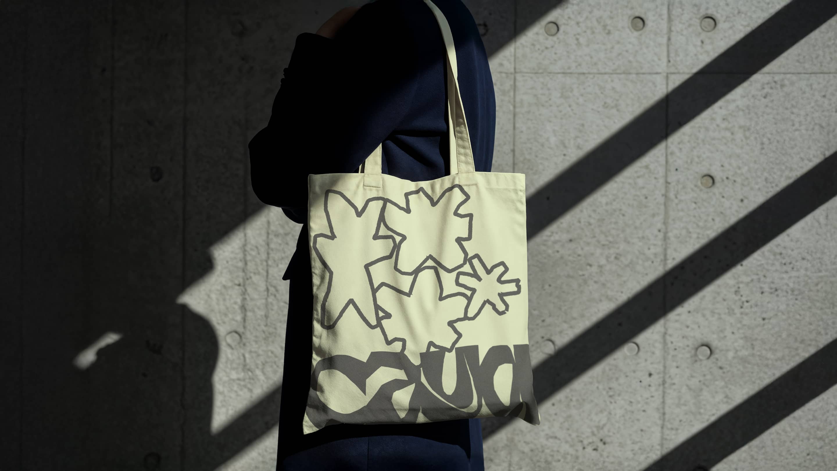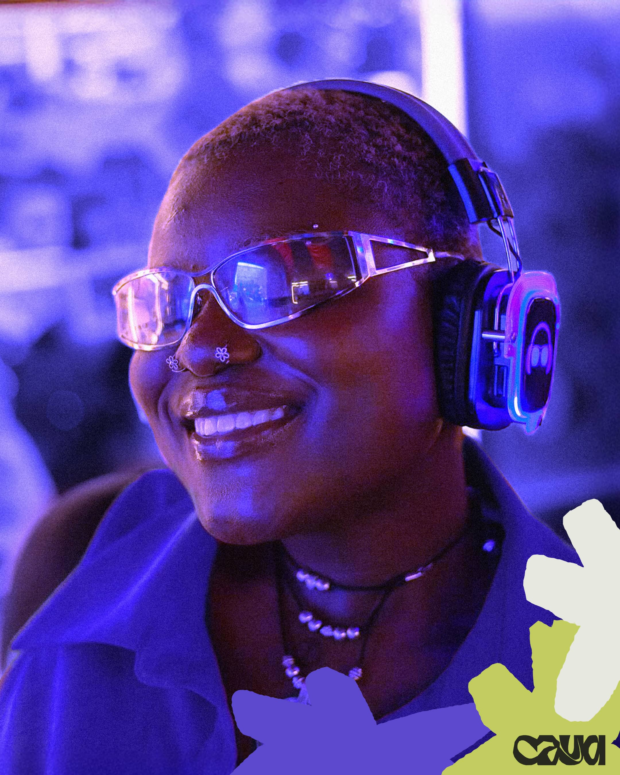
CAYA sought a brand refresh that honoured their established purple identity while evolving their visual language.
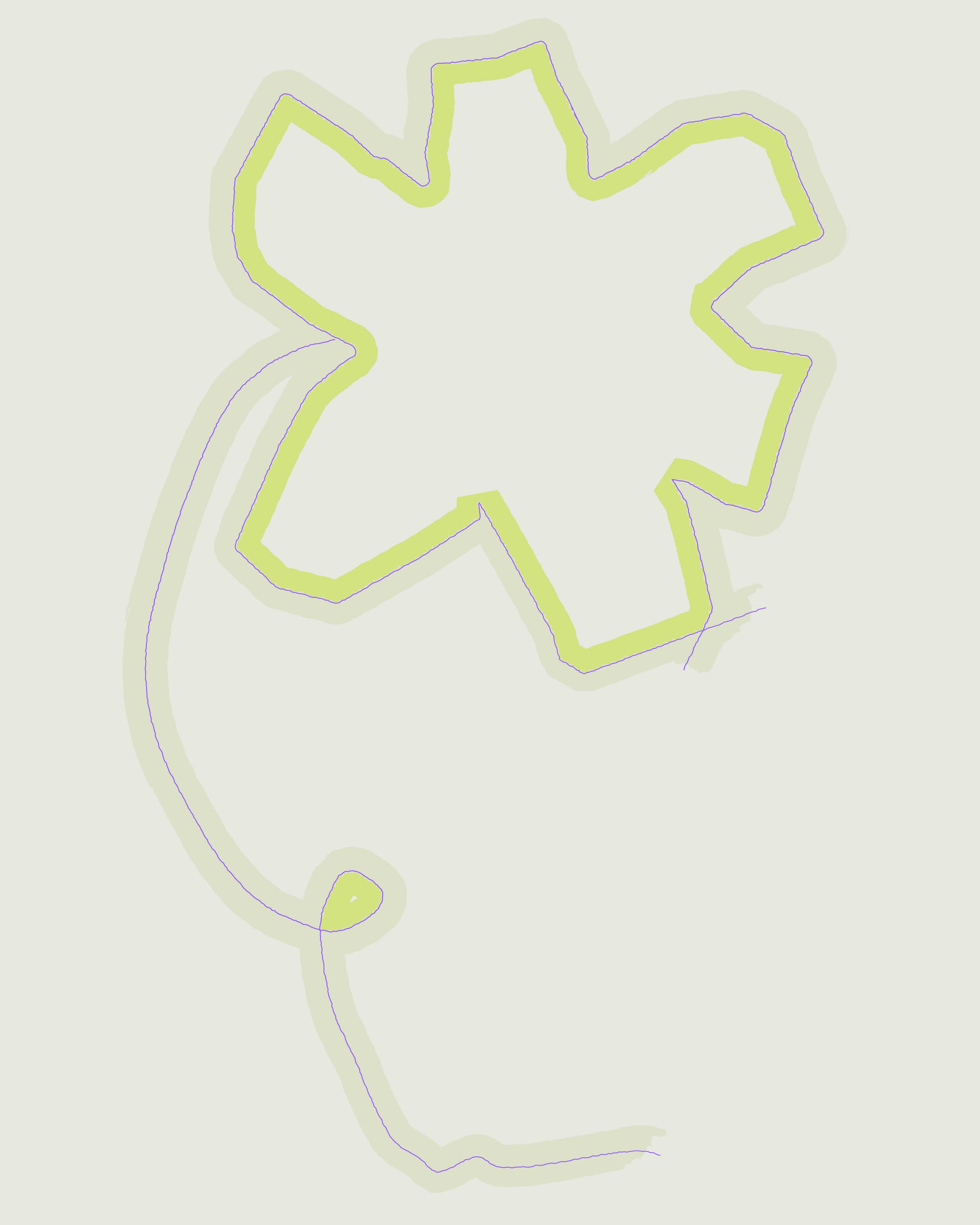
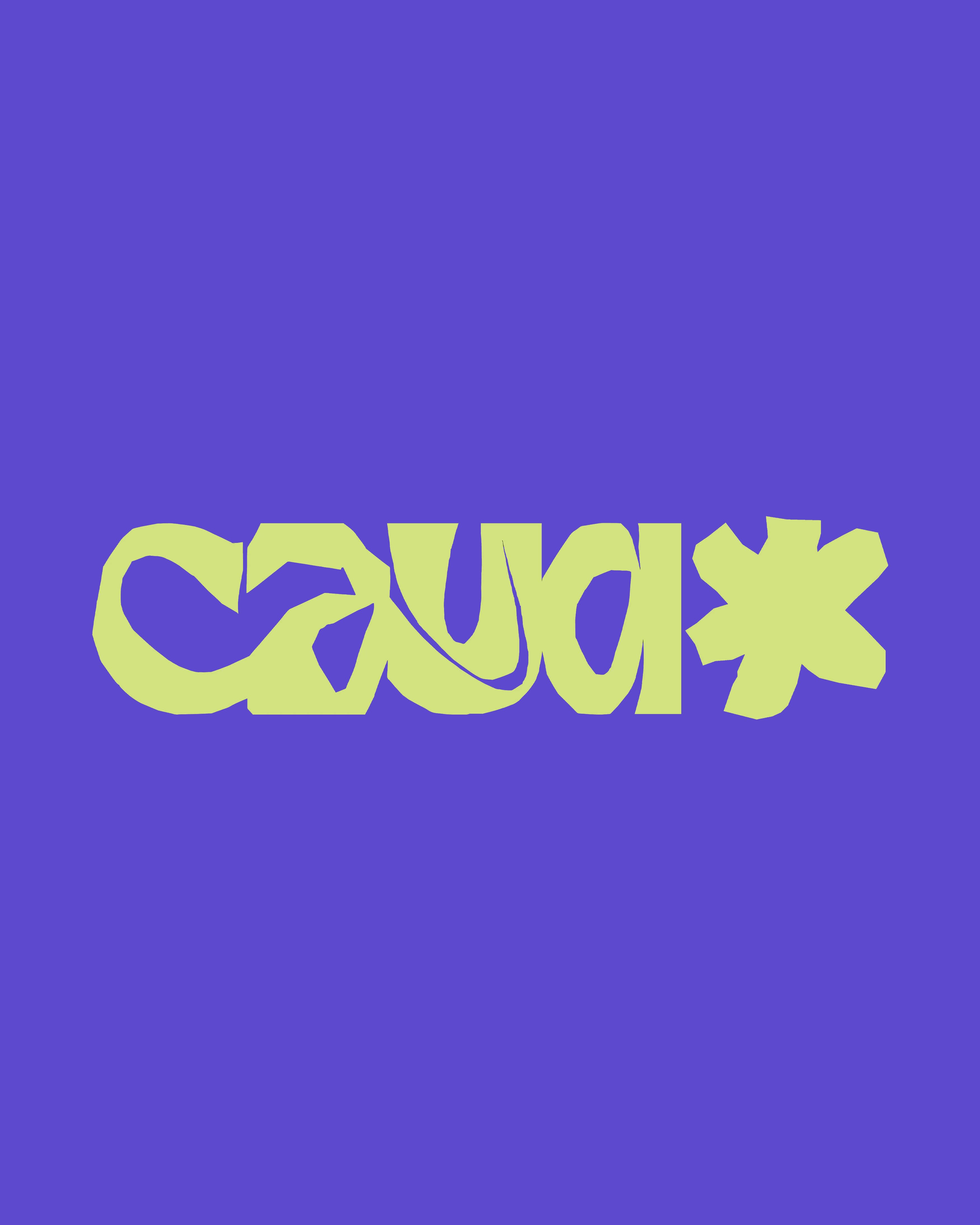
The rebrand centres on a star-shaped asterisk symbol—a deliberate choice that serves dual meaning: it represents the diverse spectrum of identities under the queer umbrella, while its organic form echoes a blooming flower, symbolising growth, flourishing, and the space CAYA creates for their community to thrive.