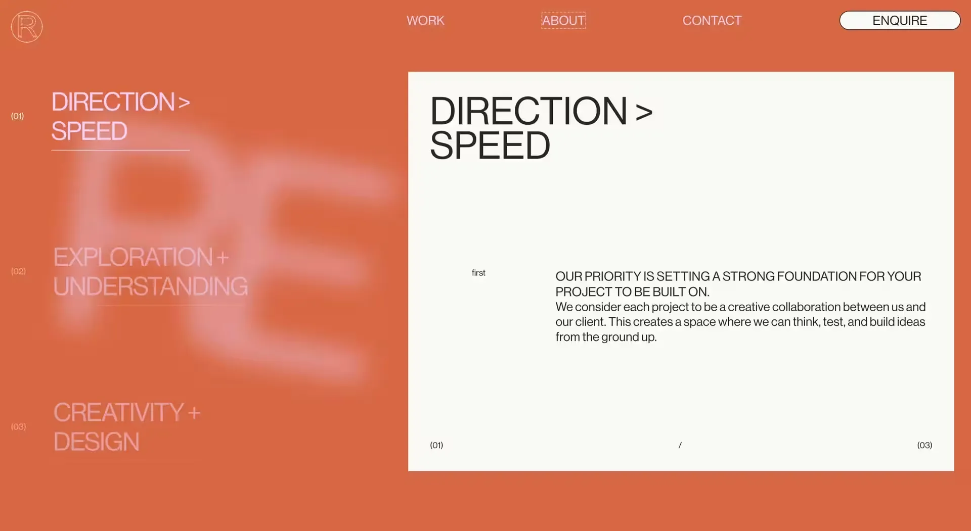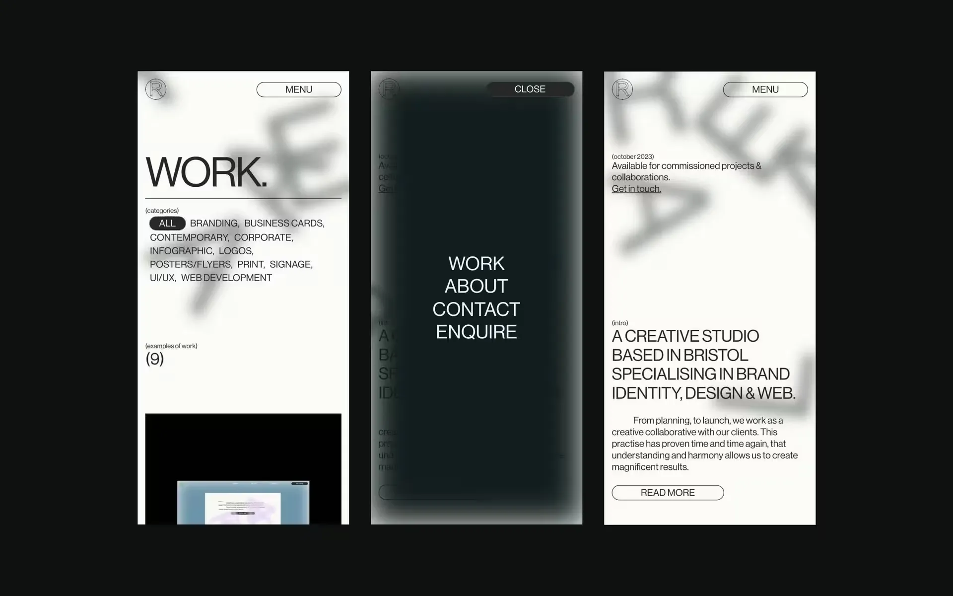
Drawing inspiration from brutalism and the blank canvas of a new website, we approached the entirety of our project as an opportunity to craft a truly distinctive digital experience.
Our challenge was to design and develop a website that achieves the fine balance between simplicity and excitement. Given that our clients comprise an equal blend of corporate and contemporary tastes, our aim was to create a platform that appeals to both markets.
Channeling the simplicity of HMTL sites before css and javascript is added, we incorporated elements such as dotted outlines and transitions without eases to create a unique visual language. For instance, the loading images display a placeholder box, the heavy use of the bold Helvetica inspired font - Neue Haas Unica, and the logo with the handles, anchor points and bounding box still present, contributed to the overall design aesthetic we aimed to achieve.


The logo, deconstructed to reveal its handles, anchor points, and bounding box, played a crucial role in achieving our desired overall design aesthetic. It symbolises the fundamental structure of design.